Agent Coaching
A systematic process where a manager coaches and documents their call center agent’s performance. I led the UI visual designs for this feature and assist in building the foundation of the Sage platform.
Team
UX Visual Designer: Anna Yoong
Lead UX Designer: Travis Ely
Product Manager: Bob Scholtz
Background
Capital One presents Sage, management tool to better the servicing quality of the customer experience. With no exiting history of design thinking in the platform, our team of 3 designers were asked to built Sage from the strategy planning of Sage’s IA to the final visual decisions. This was a unique opportunity to built based on user experience and made by the design strategy of Capital One. I had the opportunity to work across multiple teams and gain insight on strategy planning and execution.
Sage coaching will be the first feature to be released on the new and improved Sage.
User Group
FLM = Front Line Manager. Manages a team of call center agents. Involves coaching sessions with agents to improve quality of their calls with customers.
Agent = A call center employee
Problems
01 Hard to navigate as front line managers had to manually submit each coaching session (4 in a month).
02 Must pull up multiple screens to do a call assessment and coaching.
03 Confusing coaching process and takes days to submit a coaching session,
User Flow
The Old
This is the first time that Sage has a design team to work on this platform. With that said, most of the visuals were never gone through the Capital One design process. This was a unique opportunity to create from the ground up.
Discovery Design Jam
With a team of product managers, a tech lead, a ux strategist (facilitator), the product owner and stakeholders. The ux strategist and I led the wireframe design as we discussed needs, additions and the complex process of coaching. Below are snapshots of our 3-day sprint and the level of information we received.
User Flow
Wireframes
Before delving deeper into the visuals, I created a low fidelity overview of each page and developed a simplified user flow of the main screens. This helps keep the future visuals consistent using the design system (Connex). With that, I created multiple concepts in low fidelity to present across the design team. We reviewed and assess to find the right layout that represents our brand as Capital One.
Design Development and Refinement
After the initial wireframe design, I prototype the main concepts to test with agents and managers. We uncovered more unknowns and complex nuances in which we needed to re-iterate. We had conversations with cross channels, tech teams and our design team on priority to deliver for MVP. We took consideration of the scope, level of effort and impact.
User Testing
After the second round of testing, we reviewed with the team on the compromised changes for the MVP scope. We dug deep into the problem and came up with several solutions and UI changes to benefit the agent and the MVP timeline.
Feedback from agents:
Simplify the information in the call assessment page
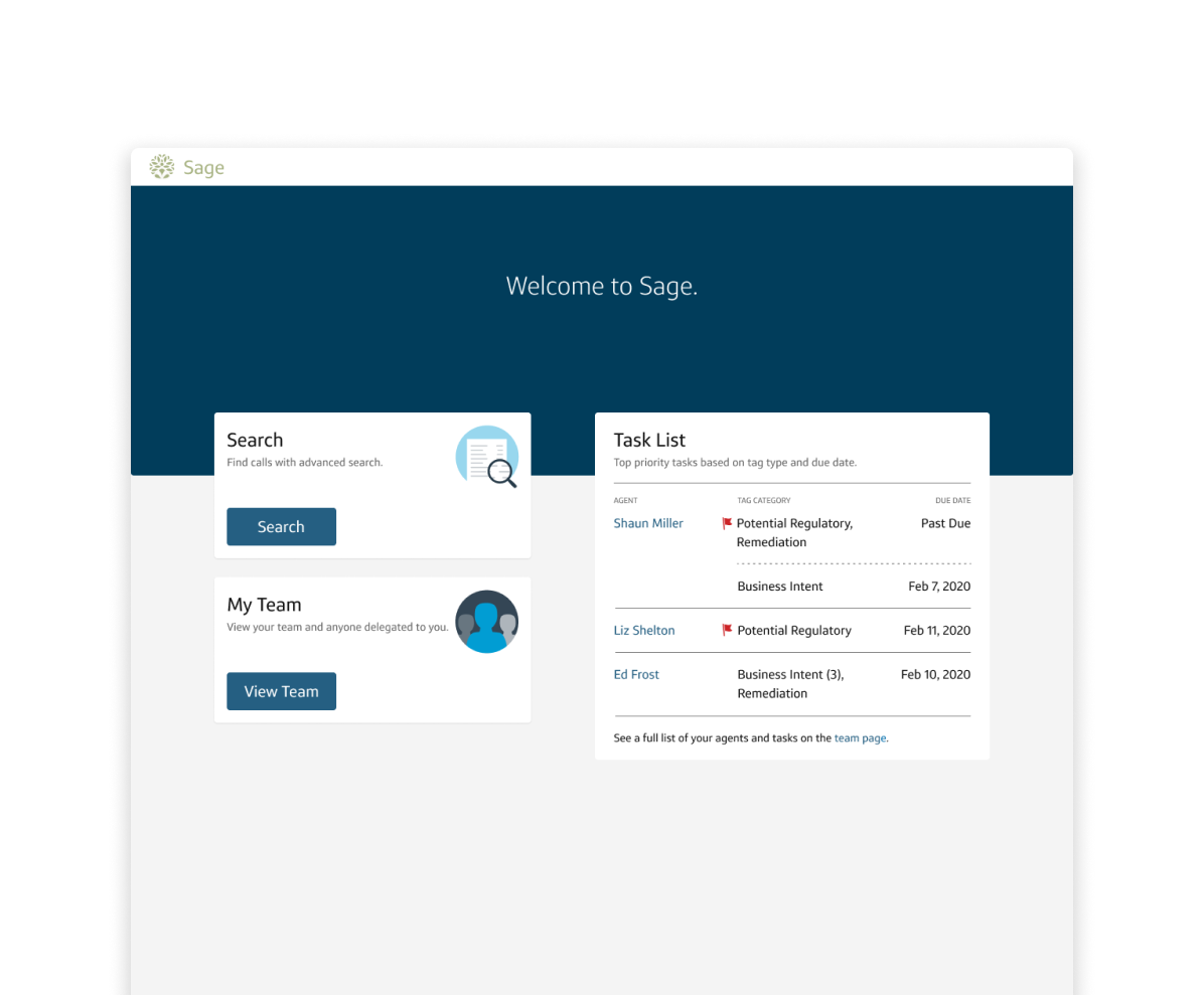
The landing page is delightful and easy to understand, but, the information that they need is hidden and hard to find in the new sage page.
Surfacing the action items above the page without excessive scrolling
Final Designs
Based on the previous user feedback, I made several iterations after. I had to make tradeoffs with the team to meet our user goals within the MVP scope. Since we are focusing on delivering happy paths, I was able to refine the design on time.
Findings and Reflection
Sage Coaching was the first rollout on the new and improved Sage platform. As of early November, it has been launched to managers and agents nationwide.
With a large team and a hard working PM, we were able to shut down the previous coaching system (ACA) and remove unnecessary human error and cyber risks. I’m astounded by the relationships that I build across the network of teams in Capital One. They are knowledgable and humble in helping us solve the complex process of Sage. It has never been easier for agents and managers to do their work and the elated emails we received for the new UI infrastructure.


